WHAT WE DID
Brand Identity
Visual Concept
Design
Web Design
CLIENT
QUAM
YEAR
2022
Brand Identity
Visual Concept
Design
Web Design
CLIENT
QUAM
YEAR
2022
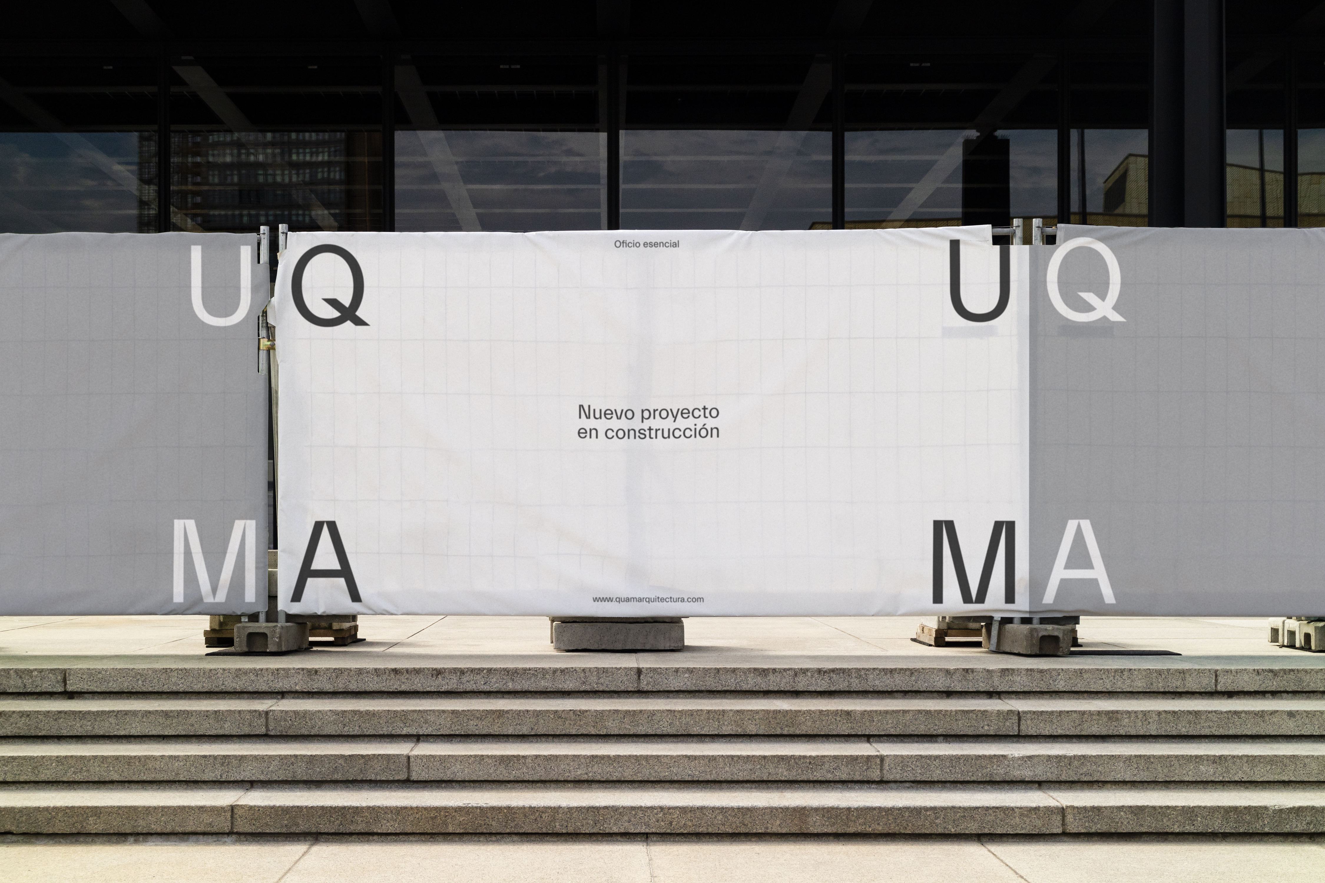
QUAM is an architecture studio founded in 2002 resulting from a synergy in balance orchestrated from the architectural concept to promotion, interior design and landscaping. In response to its new brand positioning and core values, they comissioned us to push their visual narrative forward by a brand identity refreshment and a new website design www.quamarquitectura.com
As an evolution of their old logotype - which seemed rigid and technological - built in a squared shape layout, we expanded that essential idea into a more flexible and dynamic responsive wordmark based on the four corners of the square which symbolizes the four main core concepts of QUAM: craft, environment, composition, and artistry.
The new wordmark is supported by new typography and a flexible system conveying the essentialism of architecture from its core visual element: the square.


