What we did
Visual Identity
Concept
Art direction
Design
Client
Cineteca Madrid
Year
2016
Visual Identity
Concept
Art direction
Design
Client
Cineteca Madrid
Year
2016
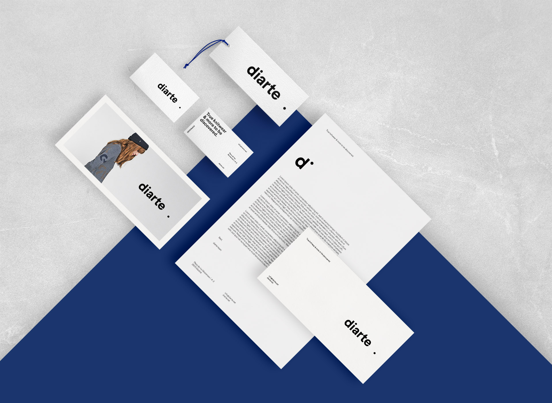
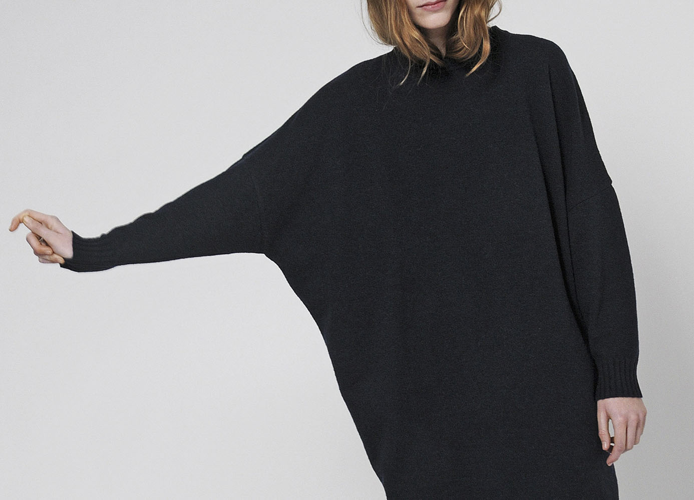
Diarte is a knitwear focussed brand established in 2010, based in Madrid, where all design and production is made. The brand follows strong convictions towards ethics and social consciousness. The brand is loyal to tradition and craftsmanship techniques, and selects high-end Italian yarns to present #trueknitwear collections that can last season after season.
We faced the challenge of renewing the brand’s strategy through a completely new visual identity based on its claim 'True knitwear and more to be discovered'.
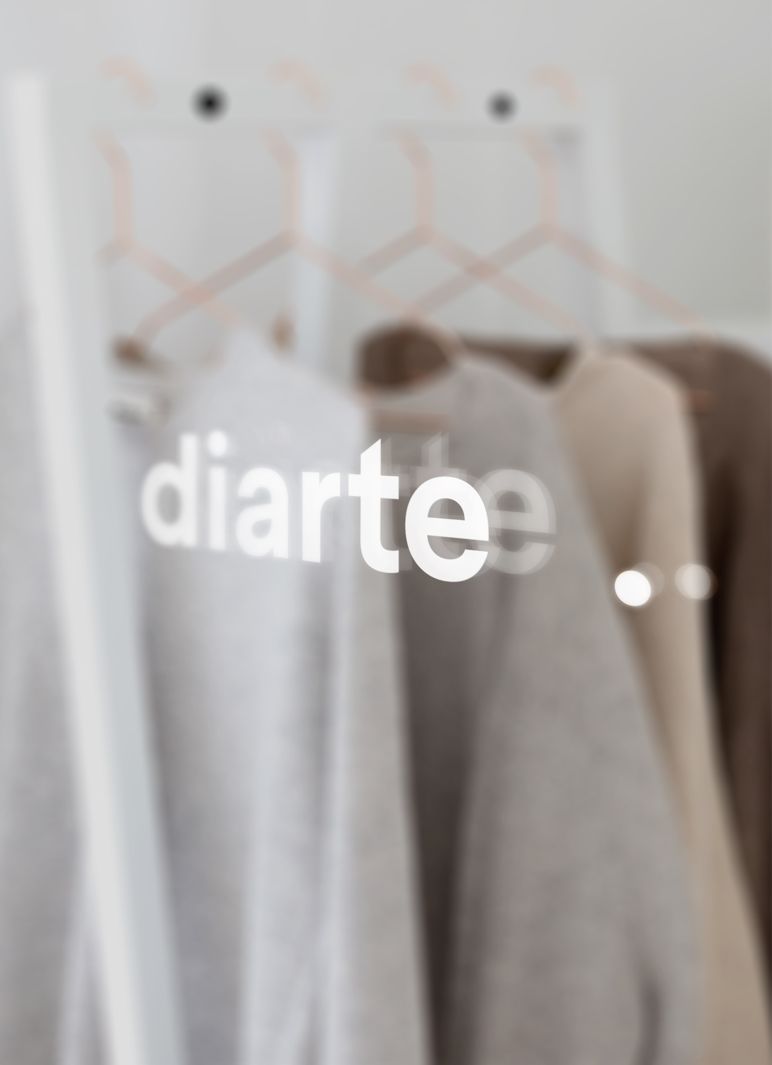
In spanish the word 'punto' has two different meanings: knit and dot.
That´s why we created a visual identity around the graphic representation of a d ot, not just to emphasize the connection between 'knit' and 'dot' in spanish, but to give strength and clearness to Diarte´s logotype.
Diarte wants to keep on innovating and discovering new ways of surprise people with their collections, that’s why the position of the dot in the logo -a bit separated from the word diarte- gives dynamism to the composition where it seems to be in movement connecting to brand's explorer archetype.
Featured on The Brand identity, Design Ideas, gráffica, Behance Branding Gallery, Mindsparkle Mag and Sandu Publishing.
We faced the challenge of renewing the brand’s strategy through a completely new visual identity based on its claim 'True knitwear and more to be discovered'.
In spanish the word 'punto' has two different meanings: knit and dot.
That´s why we created a visual identity around the graphic representation of a d ot, not just to emphasize the connection between 'knit' and 'dot' in spanish, but to give strength and clearness to Diarte´s logotype.
Diarte wants to keep on innovating and discovering new ways of surprise people with their collections, that’s why the position of the dot in the logo -a bit separated from the word diarte- gives dynamism to the composition where it seems to be in movement connecting to brand's explorer archetype.
Featured on The Brand identity, Design Ideas, gráffica, Behance Branding Gallery, Mindsparkle Mag and Sandu Publishing.